
Brand renewal
Amston
Full renewal of the brand identity.
Website development.
The task
Radically change the brand and its communications. Develop and execute strategic and tactical communication actions, from an identity renewal to the electronic means.
Analysis
Brand
position
A small yet ambitious brand that provides top-notch services to organisations that generate significant added value.
Brand
ambition
To become an international player in its market segment, while operating not only in Lithuania but also abroad.
The environment
A wide and competitive environment with both big and small players. However, the bigger organisations need a stable partner that will ensure a constant flow of competent employees.
Users
We are focussing on large organisations that are aiming for a full range of quality services. Also, we are partly focussing on talent that is seeking employment.
Contact
The first contact with the customer is made through recommendations, after which the customer will check the information online. Some of the employees may be frequent visitors to the website, following established habits.
The brand
A progressive and unique brand that clearly communicates competence and exclusivity.
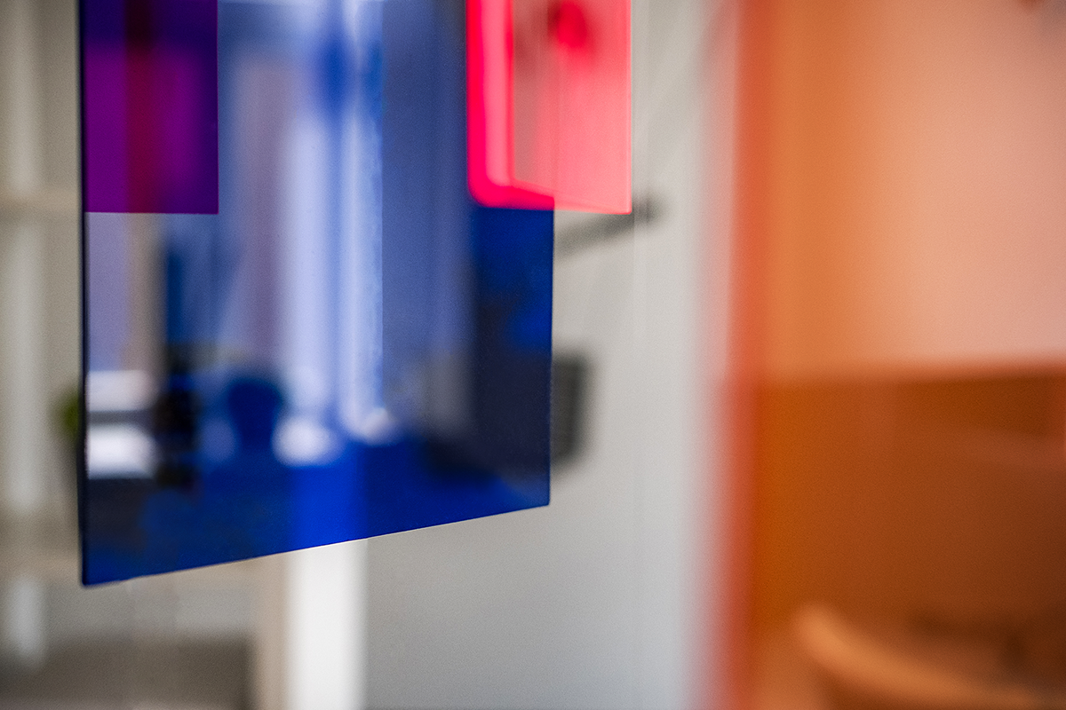
Inspiration
In her art, the world-famous artist Chris Wood reflects the synthesis of glass and light. The pieces are created from coloured glass, so that the light creates an ever-changing final product. In this way, she shows that the most important part is not the piece itself, but the way in which the different colours and light play with one another.


The concept
We suggest using Chris Wood’s art as the inspiration for the presentation of the brand. Recruitment also involves shining a light on the candidates, while looking for the right qualities and matching them with the colours of the hiring organisation. This analogy reflects Amston’s business principle: its goal is for the colours of the candidate and the client to work together perfectly, so that their reflection creates a new colour.
Explanation
1
You are looking for the right features
When selecting people with different competences, Amston looks for the right features and their colours. In a figurative sense, the company shines a light through the candidate to see the colour of the required competency.
2
You coordinate these features with the organization
Every organisation also has its own kind of light; therefore, it is important to ensure that when the colours of the candidate and the company are combined, the right new colour will emerge.
3
You add your own skills
The colour that Amston radiates can also be combined with the colours of the candidate and the organisation, to produce the right spectrum. That is how we get the perfect lush colour combinations.
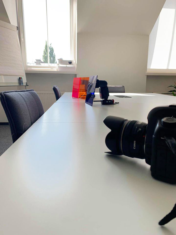
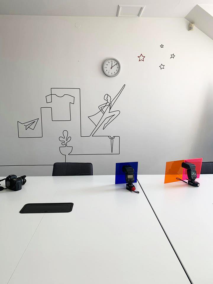
Photographs
Based on this concept, we held a photoshoot at the Amston office. With the help of “TOO Photography”, we used a few pieces of coloured glass in our experiments, shining a light through them and brightening the surroundings of the office.


The result
We produced bright and exceptional photographs that are very different from the clinical style of graphics used by our competitors. They will add catchy details not only to the website, but also on social networks and in the general flow of information.


Graphic identity
In order to achieve our goals, the graphic identity of the organisation was radically altered, based on the concept of translucent glass.
Logo
The cornerstone of Amston’s business is recruitment. Our logo reflects this process exactly. The main element of the logo is the letter O. Its unique shape is created by overlapping the three elements, forms and light. As the result of these overlapping elements, a new light is revealed, which is similar to discovering the right person or a particular potential. The brand renewal reveals a progressive brand that clearly communicates its professionalism.


Business card

Blank
Presentation
We have created a presentation template that provides both textual and graphic information. Both the new corporate style and image photographs are used here.


Method of 4 digital factors balance
This method enables to create balanced digital product. Method helps to find balance between 4 core digital factors and to show the most effective way to develop solution further.
The 4 factors
Digital experience, computer skills and time spent in digital area of users who will use the product.
Content of the product is based on text - like telling, stories, recommendation, or visual - illustrations, photos, views or video.
Users’ engagement and loyalty. The formation of user groups and habits, the need of users to come back.
The need of new formats, content interactivity and animation.
Each factor is analysed and evaluated in 8 levels scale. The result is guidelines to well balanced, maximum optimal solution for users.
Result:

Classic product

Innovative solution

Non-balanced, inappropriate solution
The dominance of textual content and clients who do not always possess extensive computer skills has led us to using a classic presentation template.
Website
The place where the clients make their decisions is on the website amston.lt. That is the reason why all the levers, that not only help us keep the user's attention but also encourage them to make a decision, are included there.
Structure of the first page:
First sight
A clear direction for the users – both clients and candidates. Below, there is an explanation for clients.
Services
The services are defined clearly and are based on keyword searches. There are also three key values.
Reputation
To prove our reputation, we have placed our main clients and their recommendations on the first page.
Personal referral
A call to action is presented, as a personal address by the head of the company. A personal connection builds trust.
Offer
Returning candidates have a regular place to find the newest job offers on the very first page.

")
Technical solution
In order to reflect the dynamics of the brand, we have used a lot of animation. Nonetheless, by implementing Vue.js solutions, we did not lose the website loading speed. Heat map research has shown that the users easily find their way to the information they are looking for. Clicks on the objects are steady.
Integration
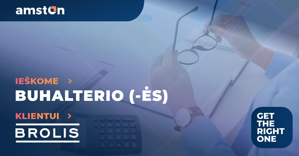
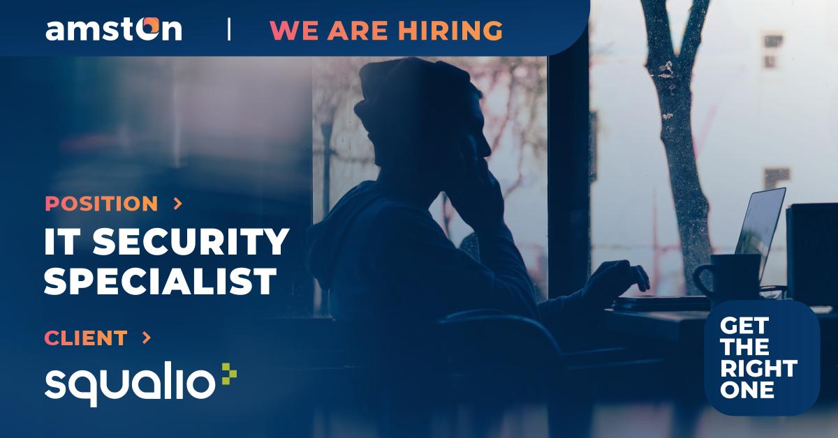
The site features integrated job offers from the common ad database, which is why the candidate receives the most recent job offers every time. This is one of the most-visited pages on the website.

A call to action is always visible
on the screen
There is a letter-shaped icon on part of the screen, which is always visible. When the user clicks on it, they will see an inquiry form. This is a universal form, designed for both clients and candidates. It is easily available and therefore increases the number of contacts.


Suitable for mobile devices
With almost half of the users browsing the site on mobile devices, adapting to these formats was a vital task. We have designed the images while taking into account the way the site will look on mobile devices. The website was tested with various different devices. The main goal was not only the correct display of information, but also to ensure an easy first contact.
Quality content
We devoted a lot of attention to the textual content of the website. We refused to employ the overused phrases that have been circulating in this domain for years. High quality English translations were provided by the Skrivanek Translation Agency.
Communication
We chose Facebook and LinkedIn as the social networks for our main channels of communication We created two message boards on both of these channels, which focus on the changes occurring in the organisation and its competencies.
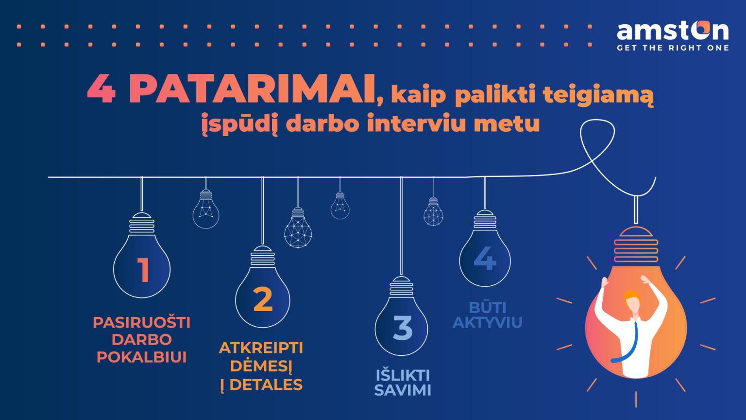
On Facebook, we talk about the competencies of the Amston team members and their outlook on their work. We also share HR marketing advice in the form of infographics.


Our LinkedIn account provides HR advice in a graphical form, as well as offers for talent who are looking for new opportunities.


The result
From the start of the project to its completion, the entire campaign took 4 months. The communications on social media are still ongoing. Over the first several months of the campaign, we achieved the following measurable outcomes:
0%
increase in incoming client requests
0%
increase in the number of applicants
0
new clients
0
new invitations to present at conferences
